
I recently watched a video that blew my mind. It asserted that red is not a primary colour
https://www.youtube.com/watch?v=kYW9GoDbPE0
The reasoning she gives is that you can't actually make a vibrant purple by mixing blue and red. To achieve this colour you need to use the actual primaries, which she says are cyan and magenta.
And of course they're cyan and magenta! Think of a printer!
But how can this be? I grew up with the Red, Blue, Yellow (RBY) system. It's what I've been using all my life. Yet, I know for a fact that I've made purple before. Case in point:

In our public schools, RBY is what we're taught. Even in university, I took a beginner art class and they used this system. However, I went through my paints and found a tube that I got back then, and the "red" I was given was actually magenta. So they likely were practicing Cyan, Magenta, Yellow (CMY) but using outdated terms.
I made a colour gamut comparing the two systems:
.jpg)
Some interesting takes here. It feels absolutely bonkers to mix magenta, which my eye perceives as red, with yellow and to get another shade of red instead of orange. I assume that if you wanted orange using CMY, you'd just add more yellow.
Cyan, despite looking similar to blue, immediately evoked in me the image of a pocket where a pen has exploded. This made me realize that "blue" pens use the same colour ink that printers do. Makes sense but I never thought about it. Red pens likely use magenta.
Indeed, red and blue make grey, while magenta and cyan, after lightening, make a kind of pale purple. So CMY wins that particular competition.
HOWEVER! You'll notice that beneath the colour wheel, I did the unholy thing and mixed the two systems. And the combination of magenta and blue made a more vibrant purple than staying pure to either.
So blue, you're still on the team. Red, you are out! It also makes sense that when these discussions come up, people always choose to beef with red but not blue. The CMY folks secretly know that blue still has utility.
But then I watched another video on the topic.
https://www.youtube.com/watch?v=fcr9K0BcN2s
This guy pulls up a colour wheel and draws a triangle between each set of three, showing the capacity of each system. Indeed, CMY creates a wider variety than RBY, however, there are still combinations that the latter can do but the former cannot. He mentions that CMY is particularly bad at making darker skin tones. Printers are racist, I guess.
He suggests burnt umber if you want to paint people, which is why the very bottom of my colour gamut is dedicated to it.
He also says that it's impossible to recreate the exact shade of red using CMY. You can make a decent approximation, but you can't replicate it. It makes sense now that the CMY folks often say that mixing magenta and yellow creates a "better" red than the one on the traditional colour wheel. If it's "better", then you have failed to recreate it,
So if you're definition of a primary colour is that it can't be made with a combination of others, then both red and magenta are primary. Indeed, if this is the logic we're using, then there are simply more primaries than some of us are willing to admit.
But all of this was not the most fascinating part of the discussion for me. The colour wheel he pulls up is round, and three points make a triangle. This leaves almost and entire quarter of the wheel untouched! How do I access those mysterious colours?
He answers that question. If you want to reach over to that side of things, your best bet is something called pthalo green.
I made a colour gamut for this secret king of its quadrant:

Mixing it with magenta gets a sort of purple, while red makes grey again. Even if it's primary, red has far less application than I thought.
The takeaway he gives is that, if you can only choose three colours, CMY gives the widest variety. But there's lots it can't do and you don't have that limit. He goes over the pallets of great artists and I think the number he says is that they all have between 9-13 colours, most with over ten.
I still wanted to see how the two systems compared when using contrasting colours. So I doodled some birds.


These aren't necessarily supposed to be good, they're just colour experiments. I used roughly even amounts of each colour when mixing for contrast. Exception is the green parakeet, where I used three tones of the same colour. The wings and head are the even blend.
I could have shown the same dignity to the canaray. Obviously could have given it more love.
I had to look up "most purple bird", which turned out to be something called Costa's Hummingbird:
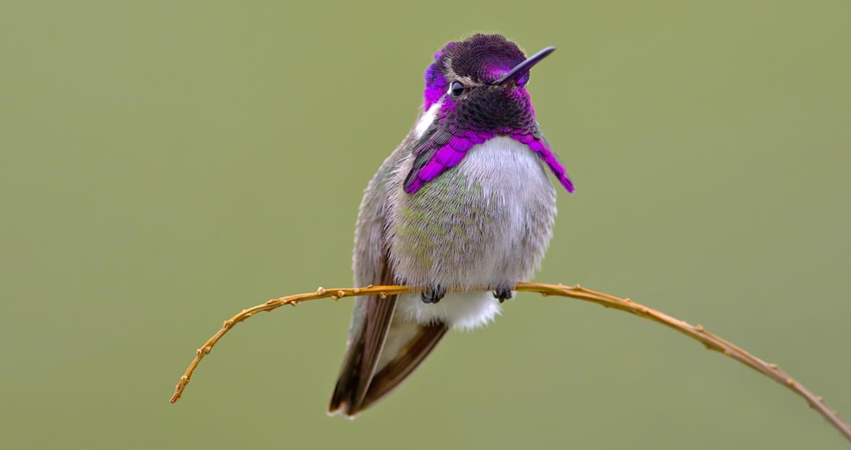
Obviously my versions didn't come out nearly that vibrant, but I needed to stay true to the experiment. If I was really aiming to do it justice, I would have used magenta, blue, and white. Or just a premix.
And all this to say, these rules only apply to the primary colours of pigment. I believe this is called additive colour theory, in which combining everything results in black. This contrasts with the primary colours of light, or subtractive colour theory, in which combining everything creates white.
I'm pretty sure that a computer screen uses the primary colours of light, so everything I've shown in this post is still only an approximation!
The primary colours of light are red, blue, and green. So if the primaries of pigment are cyan, magenta, and yellow, that means there are no overlapping colours between them! Bonkers.
No comments:
Post a Comment